It was a success! We A/B tested the new layout against the existing one and found a significant increase in the number of rewarded ads that players elected to watch on this screen in the new layout. Through additional user testing, we observed that new users now understood the mechanics of changing playlists much sooner. We already knew which playlists to recommend, and now that users were actually playing more of them we also found an increase in session time and engagement overall.
Results
Selecting a playlist is a key part of the loop and new players were not figuring that out.
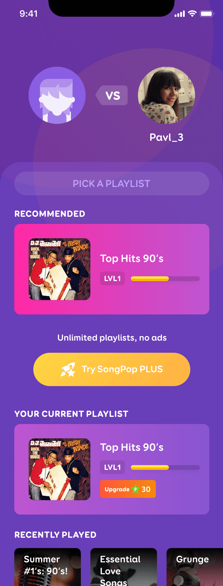
First, I added a title (“Pick a Playlist”) to the screen and a subtle container to section off the music library. After the specific portion of the first time user experience was completed (meaning that the player had seen the title a few times already), it was replaced with a search bar to allow for even more music library exploration.
Then I moved a “Recommended” playlist from an existing algorithm to the top and assigned a bright action colour to it so it would look tappable. I moved the “Current” playlist below the subscription button and gave it a less bright action colour. This was to assert that the recommended list was higher in the hierarchy of things to do on this screen. For subscribed players, the same changes were applied for continuity (but they have no “Current” playlist).
These design improvements enabled both new and existing players to discover more music and watch more rewarded ads.
Added a Title
Moved default playlist and Added a label
Added a recommendation
Brighter colour
Added a recommendation
Brighter colour
(But secondary)
How it works:
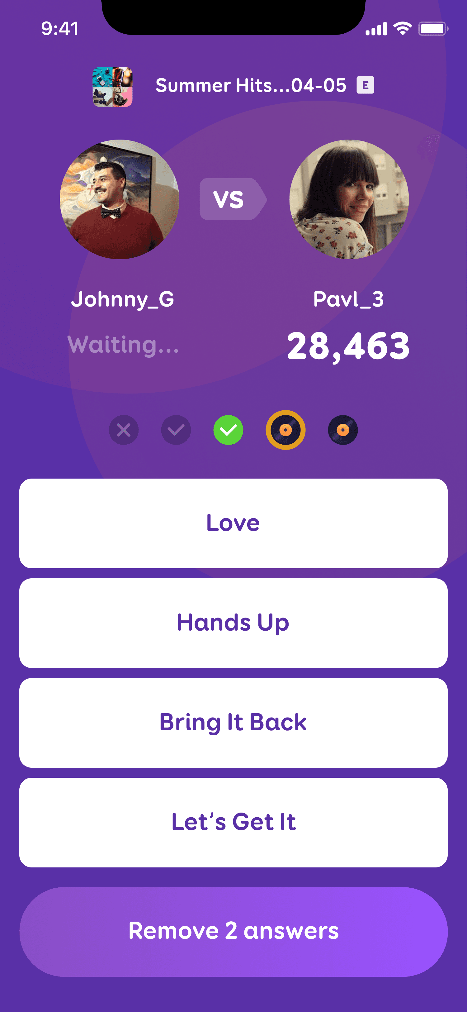
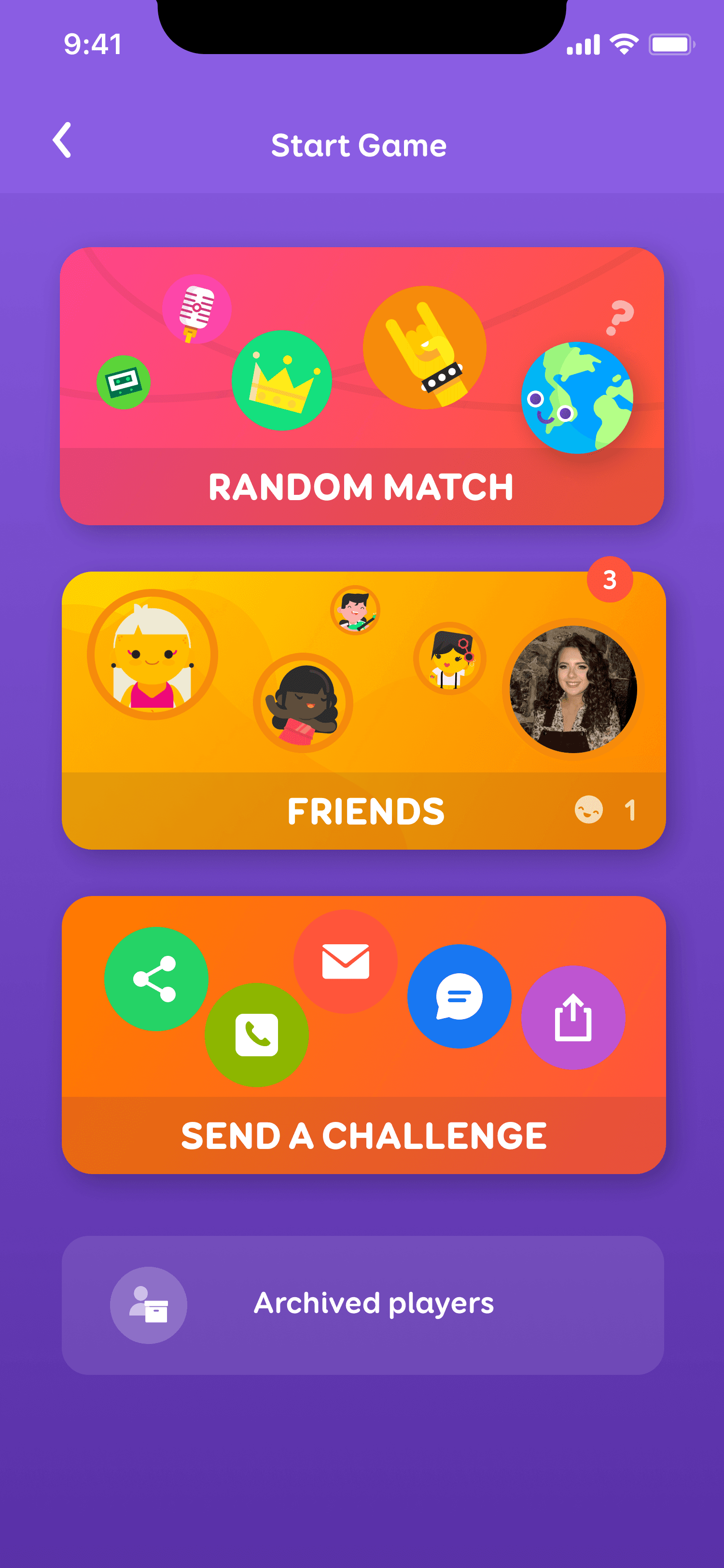
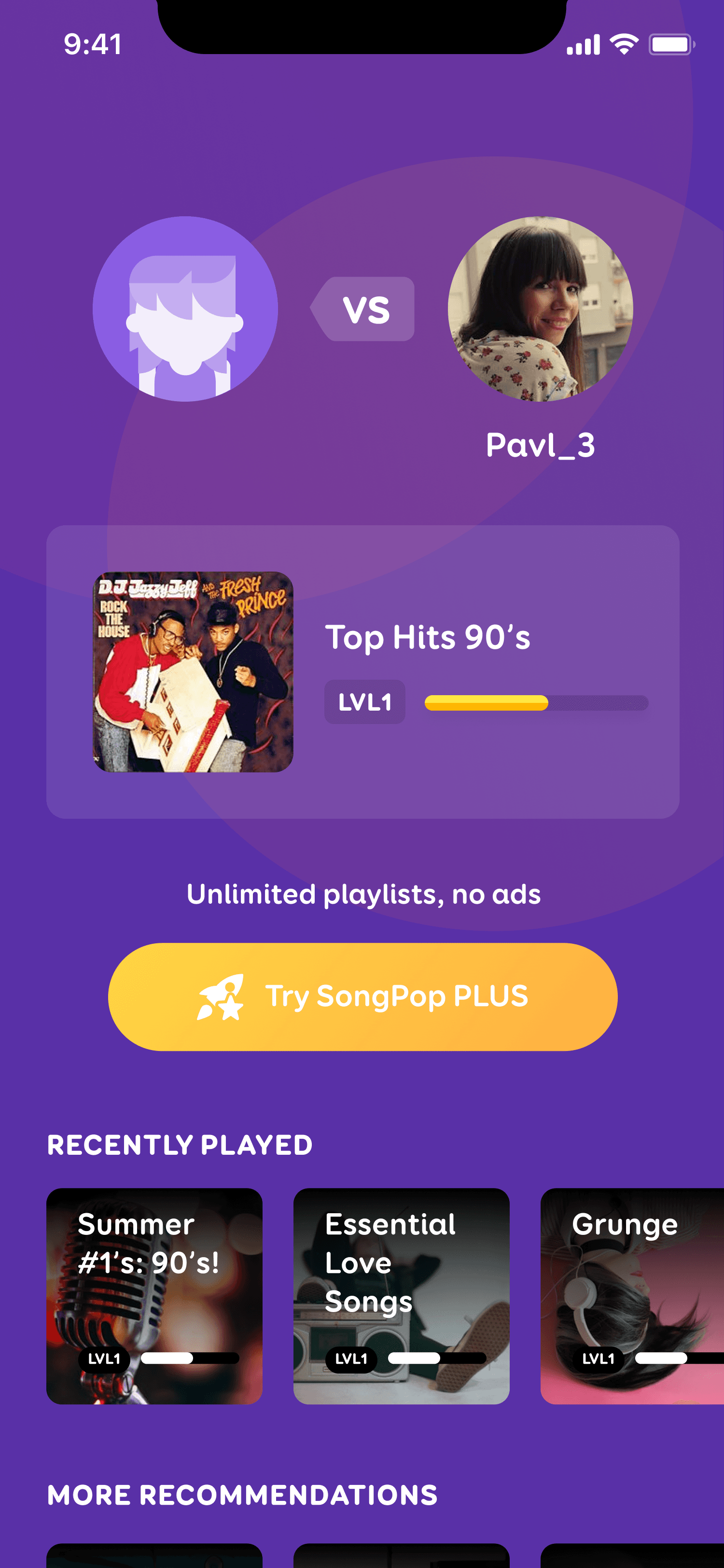
To start a trivia challenge, you usually select an opponent first and then choose a playlist.
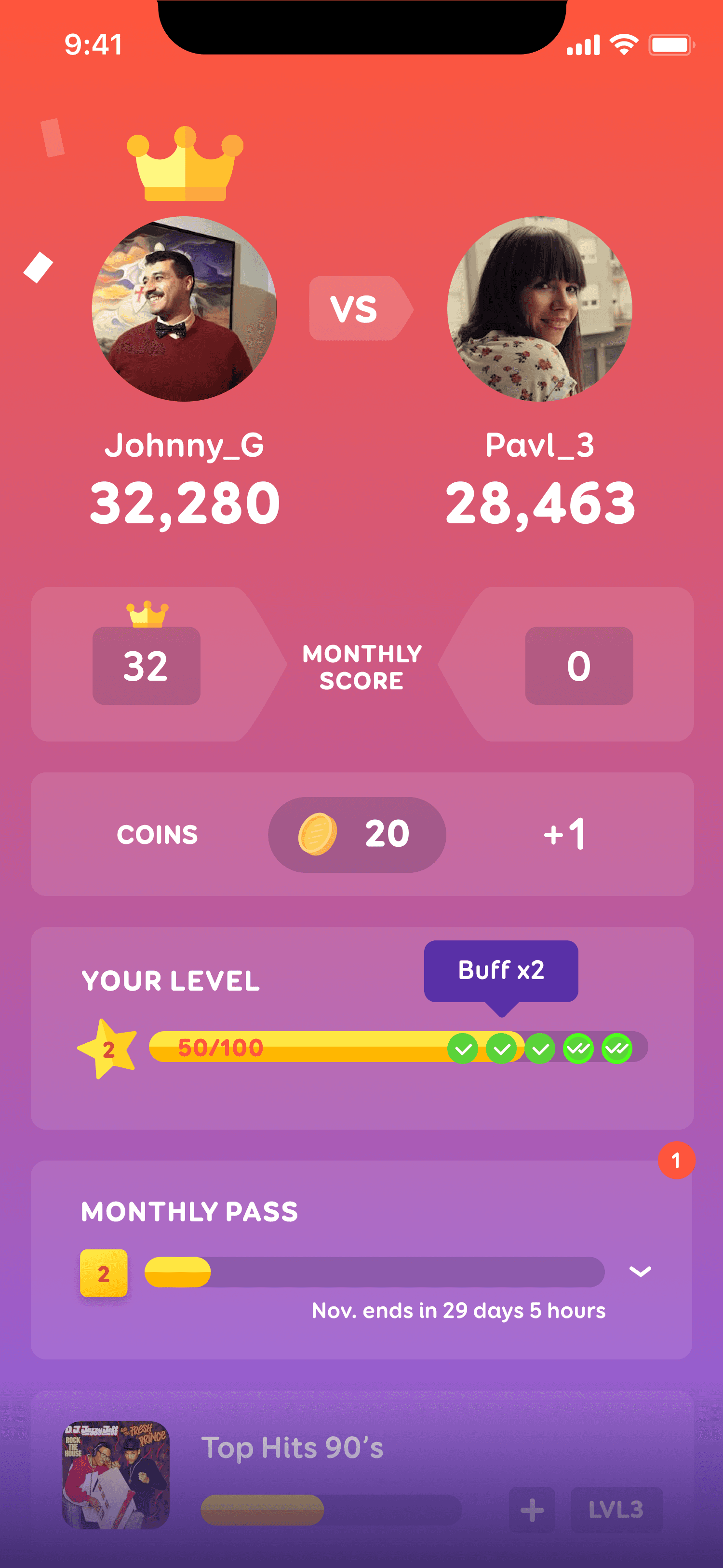
You play first (asynchronously) by listening to the song clips and selecting from multiple-choice answers, and then you send the challenge to your opponent to play when they open the game next.
The winner is determined after both players have played the challenge, after which your opponent can send another turn back.
It is then your opponent’s turn to select a playlist.
Original flow: Start a game > pick a playlist (before improvements) > play > send > repeat
This was not the time to create a spread of wireframes and UX flows to debate. The product was live and we were actively acquiring users.
I needed to come up with an alternative to test against the original to stop hemorrhaging new users, something that would be quick to design and implement.
Design
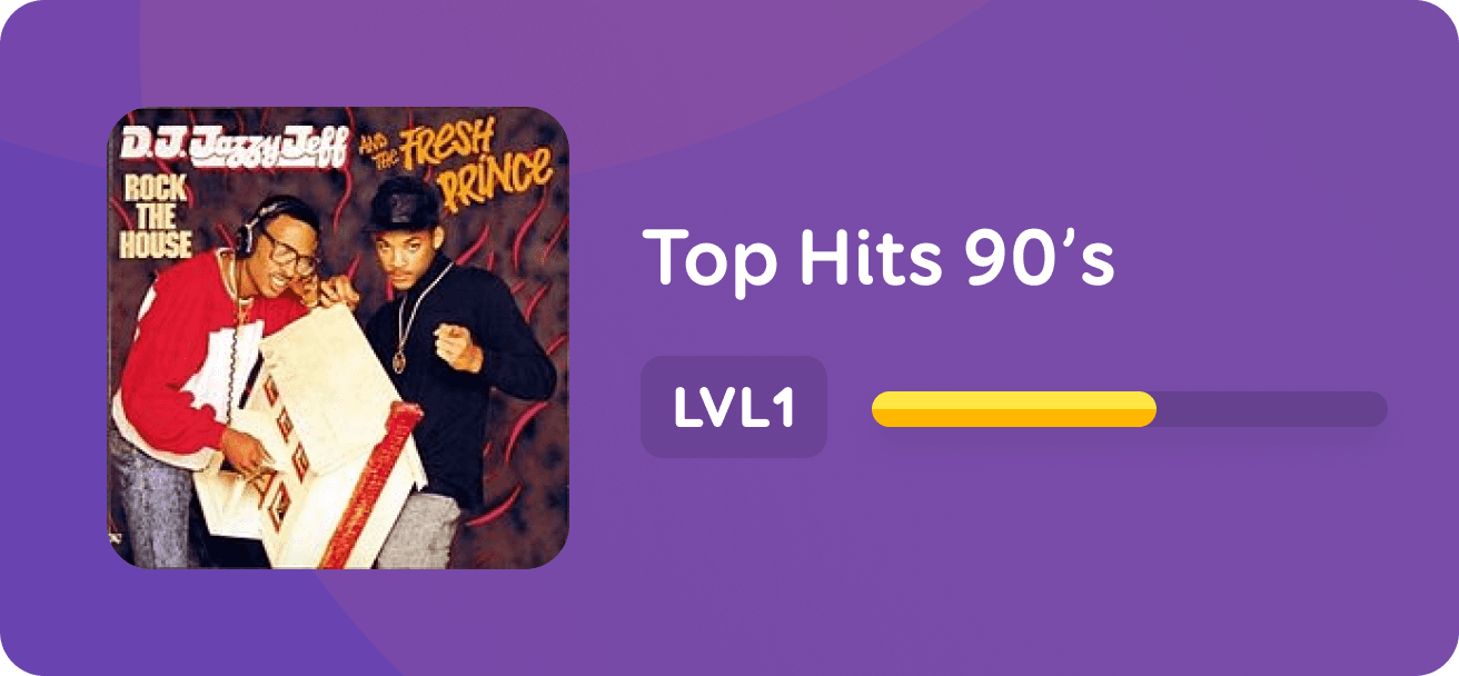
The playlist button itself was unclear. Upon seeing it for the first time, it didn’t read as a button for a lot of people, and most only tapped it after hesitating. If you’re wondering, it’s the semi-transparent white box in the image above.
We also needed to explain the concept of playlist picking. It was unclear that you have a “current” playlist that stays selected until you swap it out (by watching a rewarded ad, or subscribing to eliminate the need to watch an ad).
I worked with our developers to understand our music recommendation algorithms. New players were not even attempting to tap on the playlists below the subscription button, so I wanted to highlight recommended content above the fold to signal that this was the primary action they should take.
Nobody scrolled down. Not one person! Zero!
vs

What We designed
What Players Saw
A monthly subscription allows ad-free access to all the music content, and non-paying users can still access everything by watching rewarded ads. But when we observed first-time players in our user testing videos, many weren’t even attempting to access more content at all.
We had added a button to encourage users to subscribe, but its placement was too aggressive and players were avoiding new music altogether! They didn’t realize that a subscription was not necessary to access the music library.
The problems with this flow revolved entirely around the “Pick a Playlist” screen which suffered from a lack of explanation.
Issues
This was a problem I observed when running user tests with new players.
Instead of exploring thousands of the available playlists, users were playing only one playlist over and over, and lamenting the fact that there wasn’t more music.
I proposed the parameters of the A/B test and created the designs. It took less than a week to put together and hand off, and apart from the time we set aside to collect data, it was a quick and easy tweak.
Context
SongPop is a free-to-play mobile music trivia game with a massive music library.
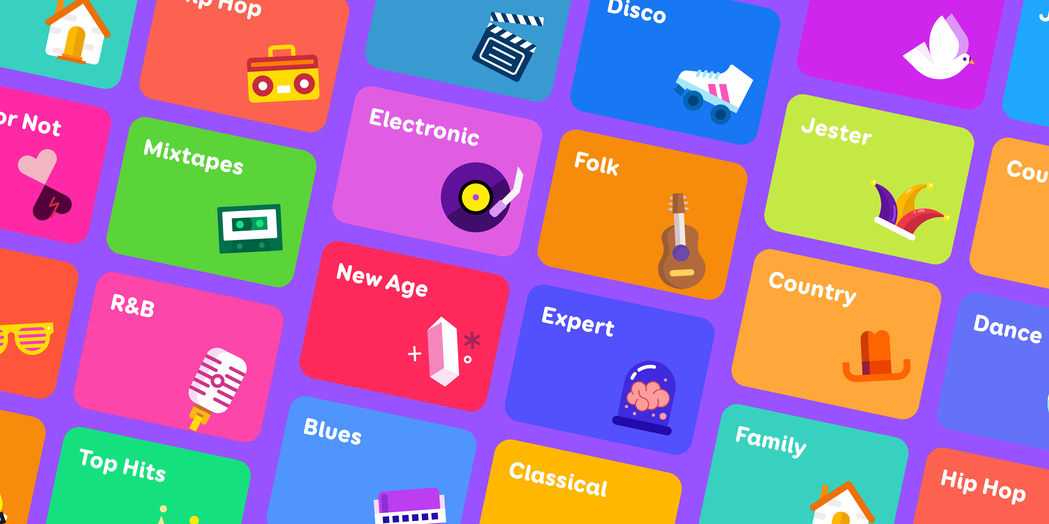
Part of SongPop’s enduring success is owed to the fact that it has the most comprehensive music library of any music trivia game out there. Thousands and thousands of songs and expertly curated playlists that will resonate with pretty much anyone.
In the core game loop, a button was placed to encourage users to convert to the subscription for ad-free access, but through user testing I discovered that the layout was gating our content too aggressively, and new players were only exposed to a small handful of songs.
I designed an improved flow that increased revenue and retention, as non-paying users elected to watch more rewarded ads in order to explore the full breadth of the music library. The more music they discovered, the more likely they would stick around and keep playing.
Summary
A team of music curators hand-picked SongPop’s playlists from hundreds of thousands of song clips.
My Role
Responsible for Research, Design, Prototyping and User-Testing & Feedback
The Team
Solo designer collaborating with Product Manager and Engineers
Timeline
April 2022
Conducting A/B testing to identify more effective methods for new users to discover playlists.
Playlist Selection.